Dashboards

Graph 1: Project Services - Satisfaction Rating. Our goal is to have a rating of 4.5

Graph 2: Project Services - Total Revenue 2011-2019

Graph 3: Regular Hourly Rate - UC Comparison to Term Contractors

Graph 4: General Funds Utility Cost

Graph 5: Total Training Time

Graph 6: Number of Courses Completed

Graph 7: Total Work Orders

Graph 8: Total Preventative Work Orders

Graph 9: Total Riders Left Behind

Graph 10: Our goal is to have 66.7% of our riders to be Satisfied or Extremely Satisfied. 69% of the passengers were Satisfied or Extremely Satisfied.

Graph 11: Housekeeping | Square Footage Covered per Person

Graph 12: Quality vs. Efficiency Index: $/GSF per Cleanliness Inspection Point The higher the bar, the more money spent per inspection point. UC pays 41.36% less than the Peer Average Cost for the same quality

Graph 13: Mail Services - Cost Per Piece Comparison to US Postal Service

Graph 14: Central Receiving Parcel and Freight - Volume and Price

Graph 15: UC - CO2equivalent Emissions per FY

Graph 16: As reported by Sightlines, UC operating costs fall below peer levels when adjusted for Cost of Living. UC's Large Building Size and High Technical Complexity drive building demands. Avg. Building Sizes: UC - 100,415 GSF, Peers - 53,747 GSF | Avg. Technical Complexity: UC - 3.66, Peers - 3.45
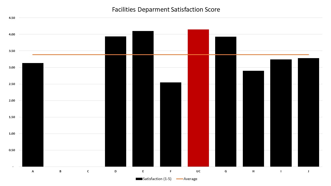
Graph 17: As reported by Sightlines, UC outperforms peers on Facilities Satisfaction Scores. Avg. Score: 3.38, UC Score: 4.15 | Peers B & C didn't report scores

Graph 18: As reported by Sightlines, UC outperforms peers on Facilities Feedback Scores. Avg. Score: 3.01, UC Score: 3.6 | Peers B & C didn't report scores